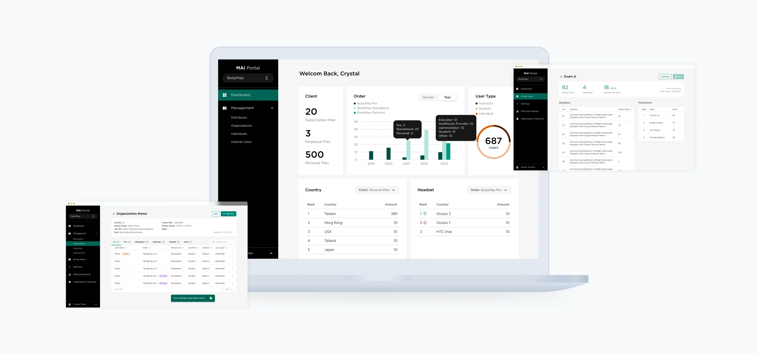
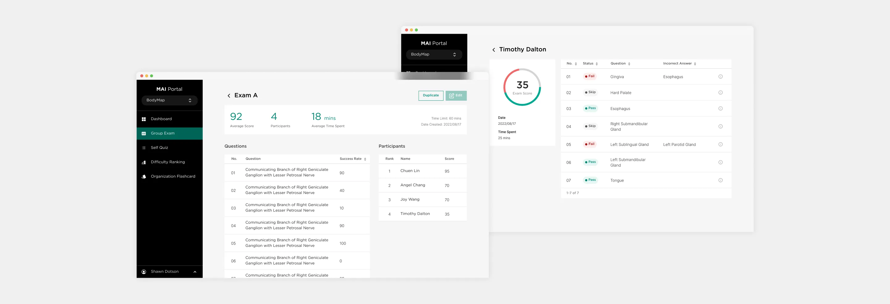
The MAI Portal's main screen showcasing the dashboard, user management, and group exam interface.

MAI Portal: Redesigning BodyMap Analytics

Project Type

Launched service; Full-time Visual & UI Designer at MAI

Team

3 Designers, 1 Frontend Developer, 1 Full Stack Developer

My role

I was responsible for flow iterations, standardized components for scalability through design systems, and handled UI design, prototyping, and communication with the Frontend Developer.

Tools

Figma

Duration

4 months (Oct 2022 - Jan 2023)

BodyMap Analytics is the existing web portal that provides administrators and instructors with tools to assess student learning progress, enhance curriculum design, and prepare exams. As our team worked on expanding the platform with VR classroom management and personalized subscriber tools, we were tasked with optimizing the user experience and improving overall usability.

● Final Outcome

This product is currently available exclusively to internal personnel, resellers, and authorized users.
View here: https://app.mai.ai/

The redesign resulted in several key improvements:

Increased Efficiency: The modular design system allowed for faster collaboration between designers and developers, reducing design-to-development handoff time by 20%.

Scalability: The use of Atomic Design principles ensured that the system could easily accommodate new features without disrupting the existing structure.

● Problem Space

Understanding

I engaged with the UX designer and product manager to gain insights into the current user types, page flows for each function, and the essential MVP features of the product.

Key challenges

  1. Complex user types with convoluted user flows
  2. No existing design files to reference or build on
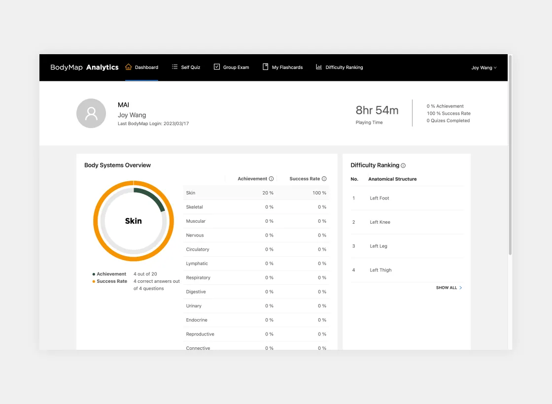
The main screen of the previous version of BodyMap analytics.
BodyMap Analytics Previous Version

Guiding Question

How can we simplify the navigation of subscriber management and VR classroom functions while creating a scalable, efficient design system for future collaboration?

● Decision-Making

To solve these problems, we approached the redesign through a series of well-defined steps:

Step 1: Identifying User Types

I began by mapping out the functionality needed for each user type. I created a modular sidebar design that categorized the necessary actions for each user role, ensuring clarity and consistency in navigation.
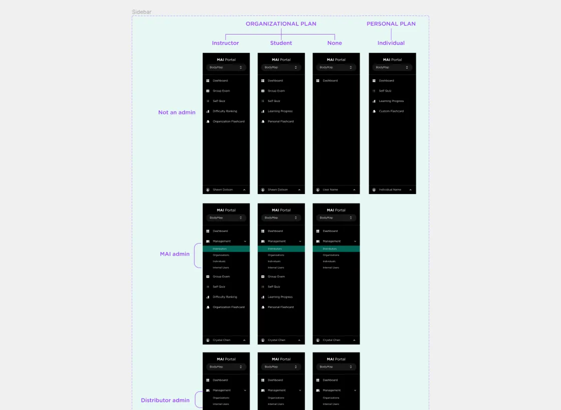
Sidebar featuring options for various user types on the MAI Portal.
Sidebar for various user types

Step 2: Organizing Complex Flows

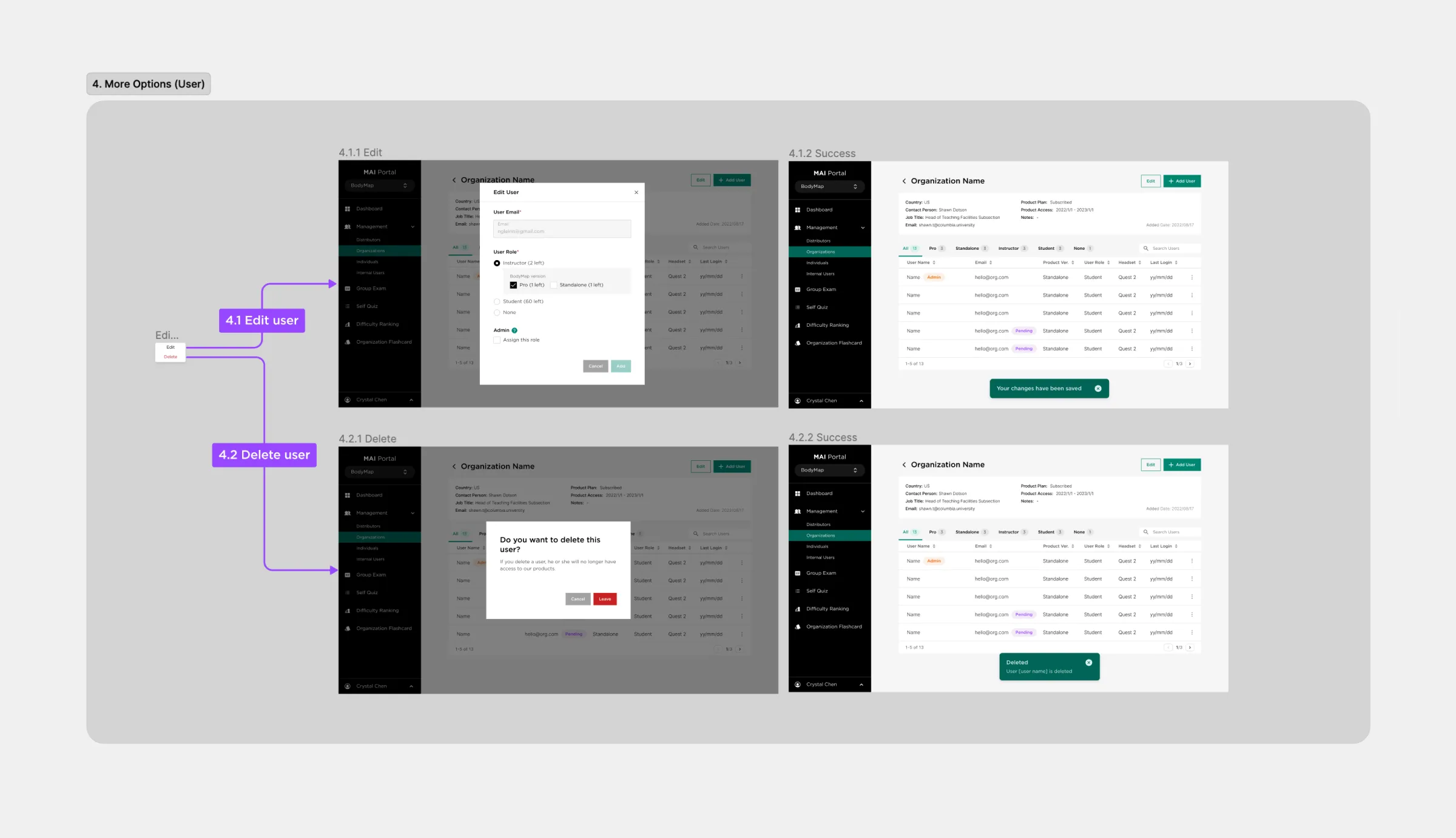
With the site containing vast amounts of information, the wireframes were initially overwhelming. To address this, I broke down the complex flows into smaller, essential steps. For example, in the MAI Admin Management: Organization flow, I divided actions into clear, sequential steps.I also developed a systematic approach to page numbering and file naming, which allowed for better communication across the design and development teams.
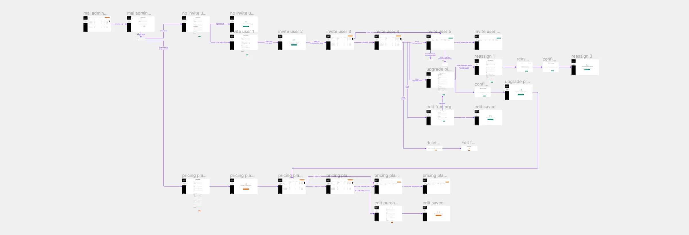
Wireframes depicting the MAI Portal screen, designed by a UX designer.
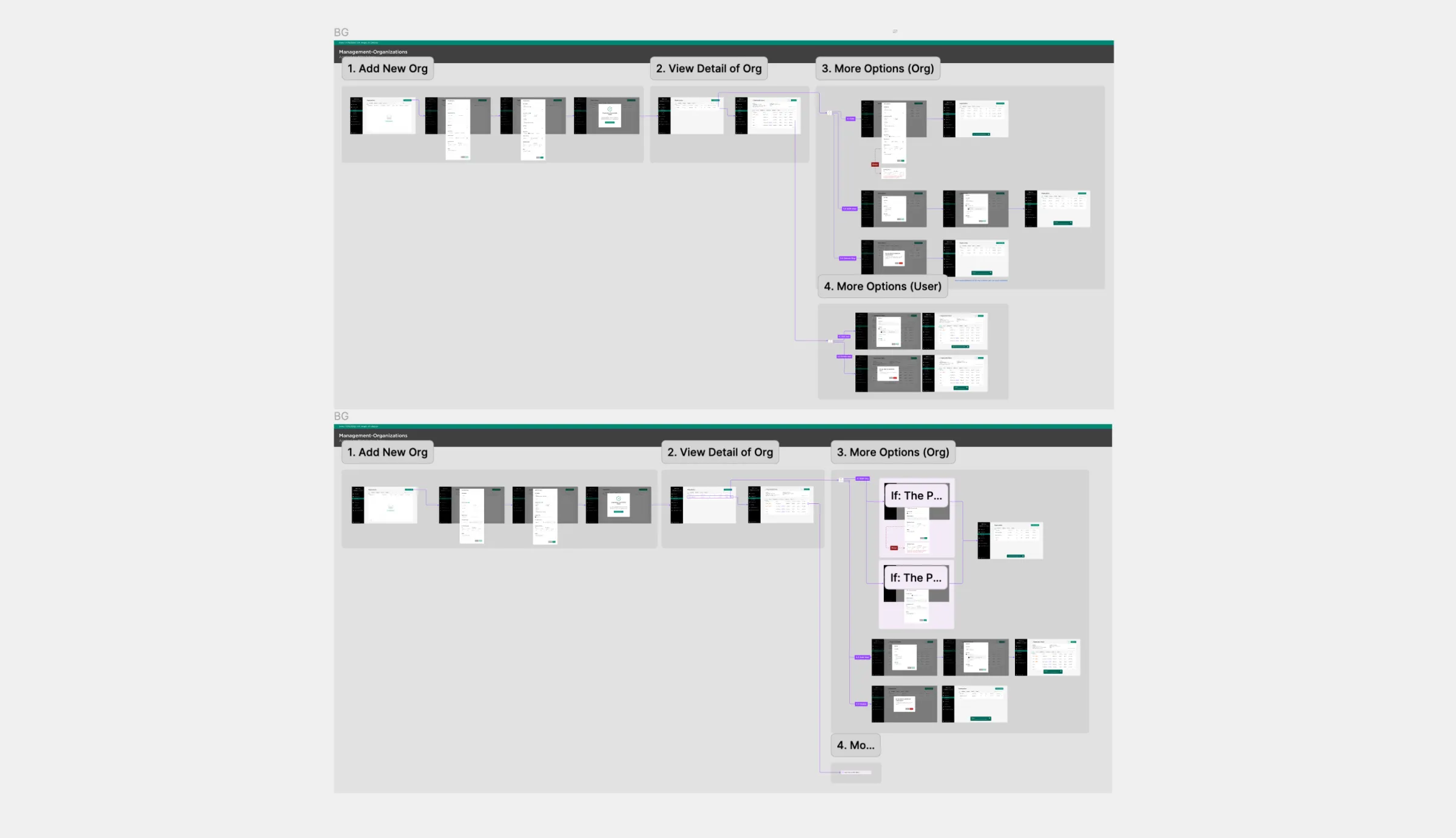
Wireframes
Final design screens, encompassing user flows and detailed views of each screen.
Final design screens
Final design screens, encompassing user flows and detailed views of each screen.
Final design screens

Step 3: Standardizing components

I identified key components that would be used across the platform, including:
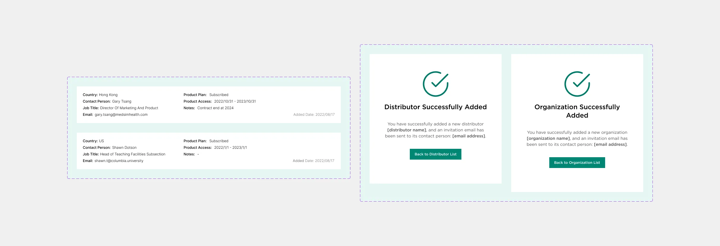
Information and message components used in the MAI Portal.
Info & Message components
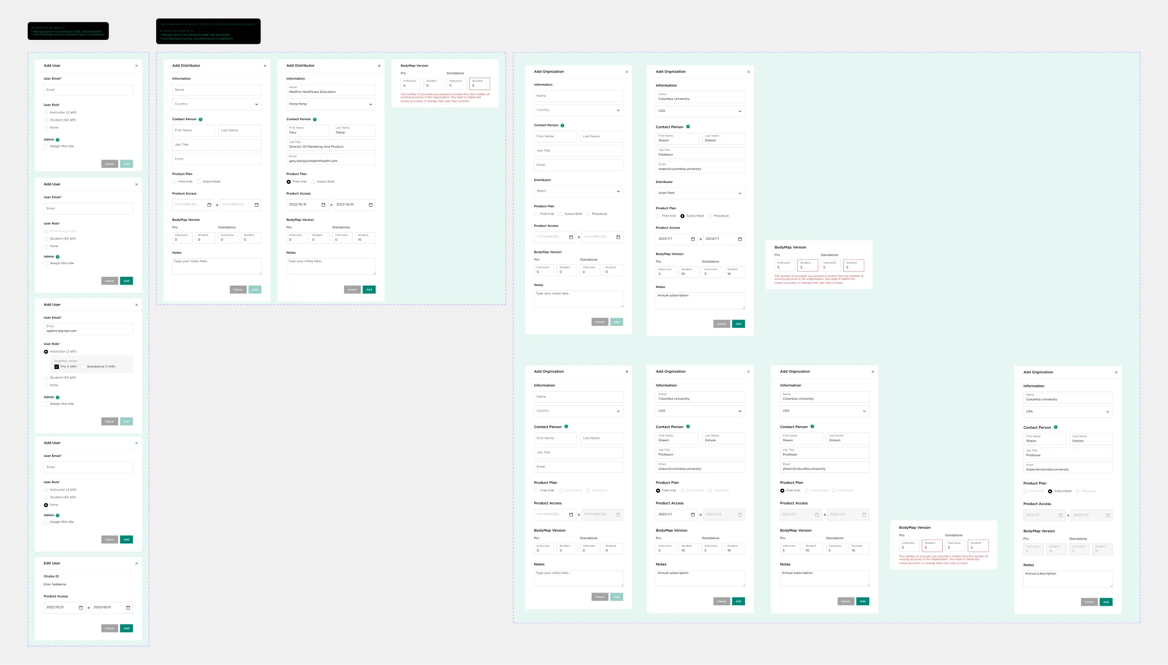
Form modal components used in the MAI Portal.
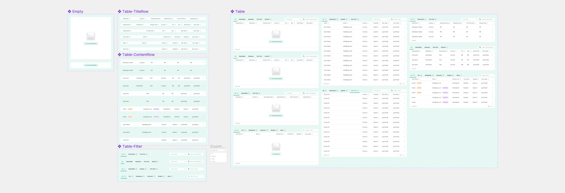
Form modal components
Table components used in the MAI Portal.
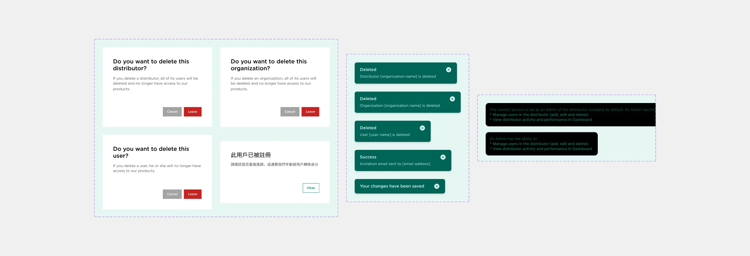
Table components
Warning modal, Snackbar & components used in the MAI Portal.
Warning modal, Snackbar & components

Step 4: Component integration

As the number of components and pages grew, maintaining consistency was key. Through discussions with the design supervisor, I applied Atomic Design principles (Atoms, Molecules, Organisms, Templates, Pages) to facilitate seamless integration and interaction among these components.
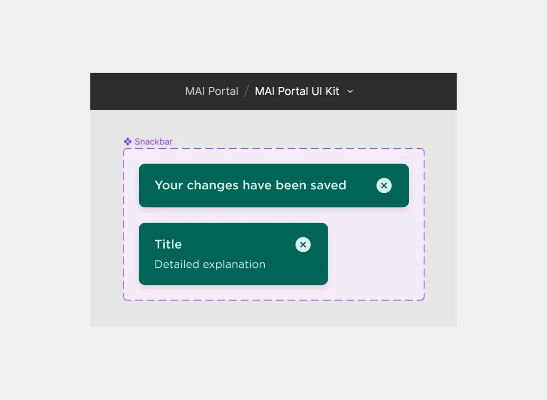
Components located within the MAI Portal UI Kit, designed for shared usage across all files.
Style variant:
Components reside in the MAI Portal UI Kit,
accessible for sharing across all files
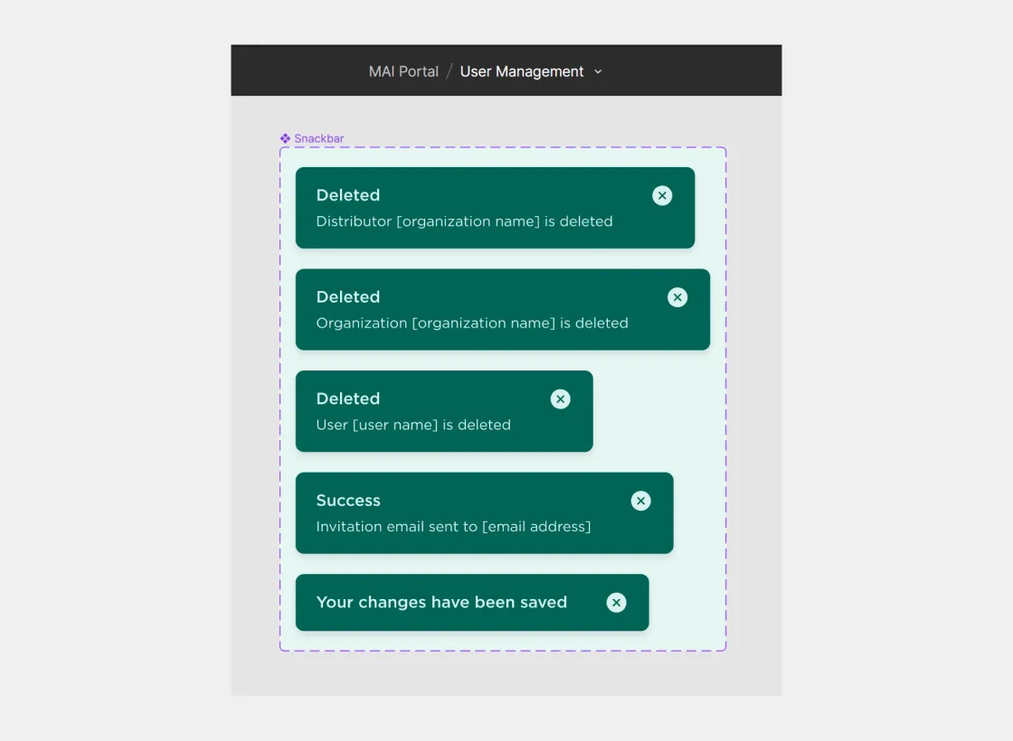
Components are situated within a function file, providing the capability for exclusive sharing limited to the confines of the specific file.
Content variant:
Individual page components were stored within their respective files
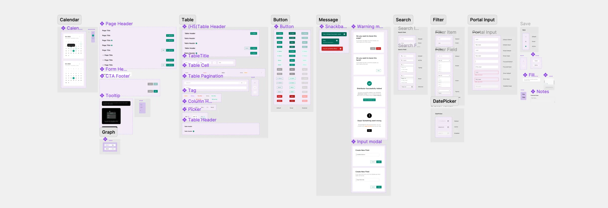
Illustration of various components featured in the MAI Portal User Interface (UI) Kit, showcasing elements such as buttons, forms, and navigation elements.
Components in MAI Portal UI Kit

● Key Features

User Management

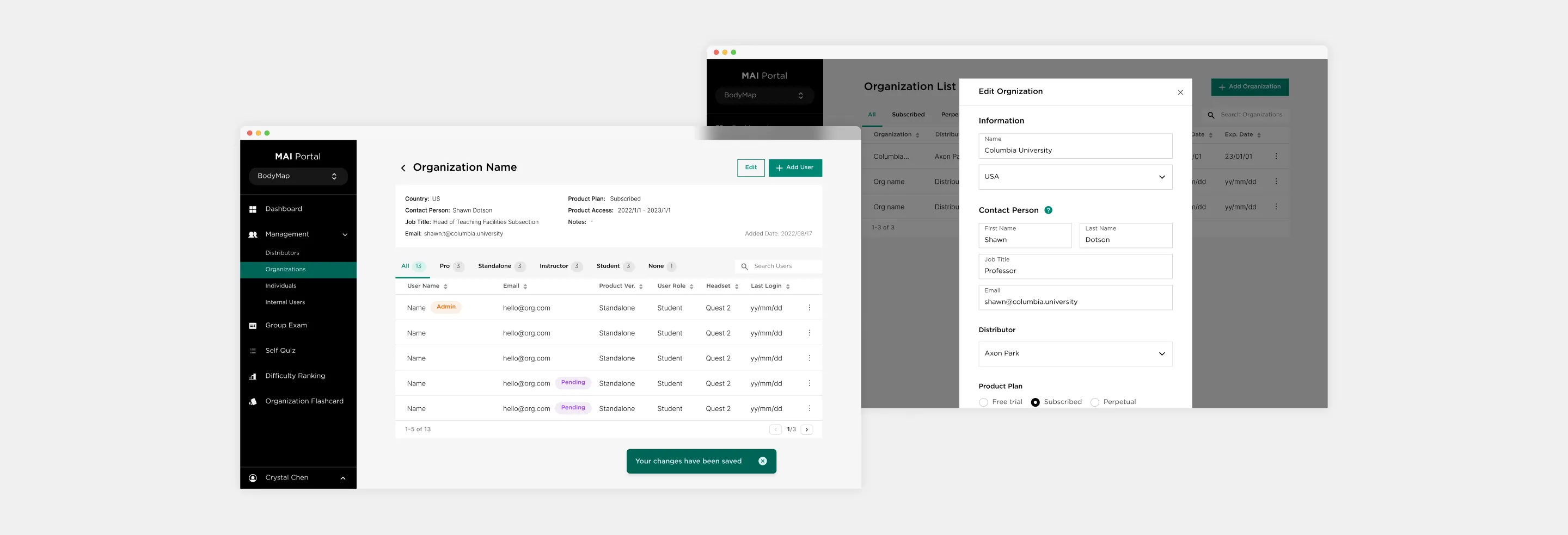
We developed this feature for administrators to manage users (MAI/Distributor/Organization) seamlessly, allowing for efficient user onboarding and account management.

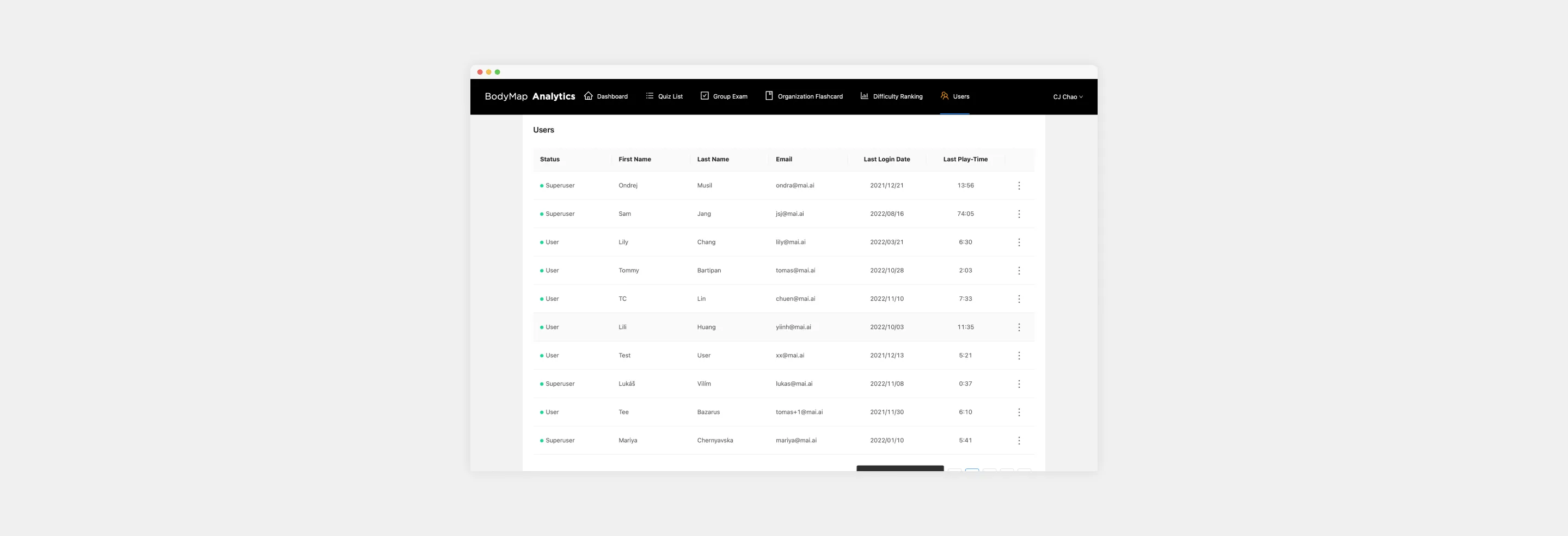
Screenshot displaying the user management page of the previous version of BodyMap Analytics.
BodyMap Analytics Previous Version, Users page
Screenshot of the MAI Portal, depicting the User Management page.
MAI Portal, User Management page

Organization & Personal Flashcard

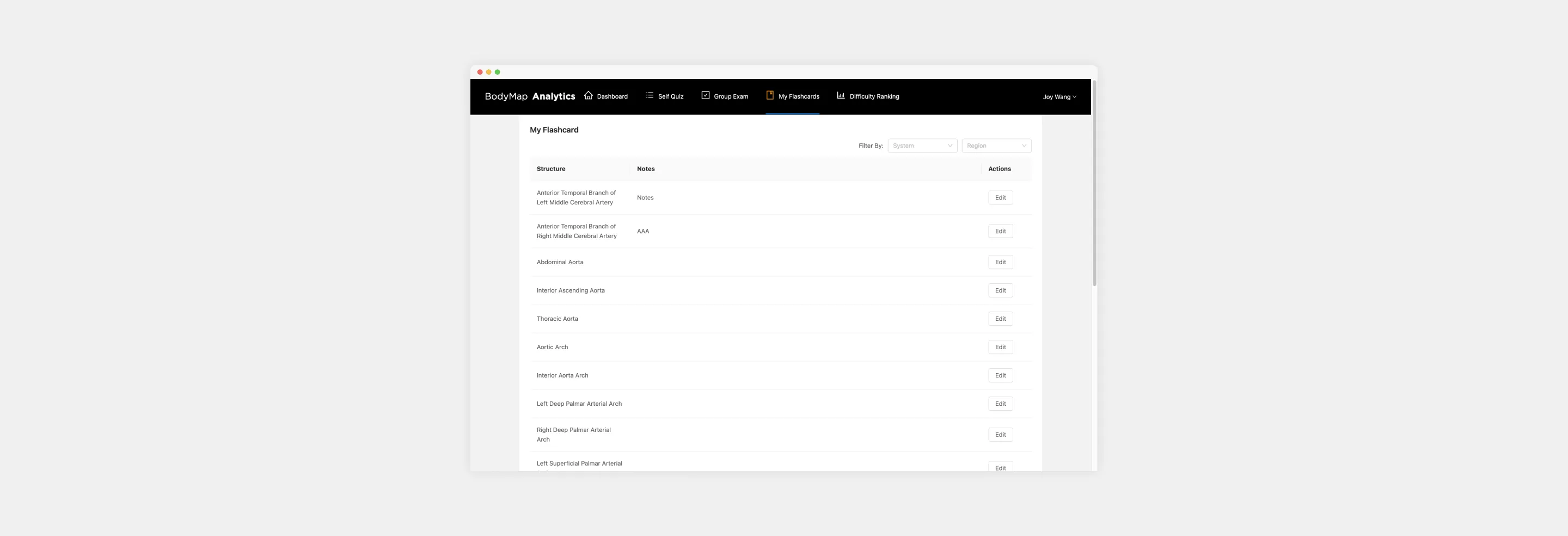
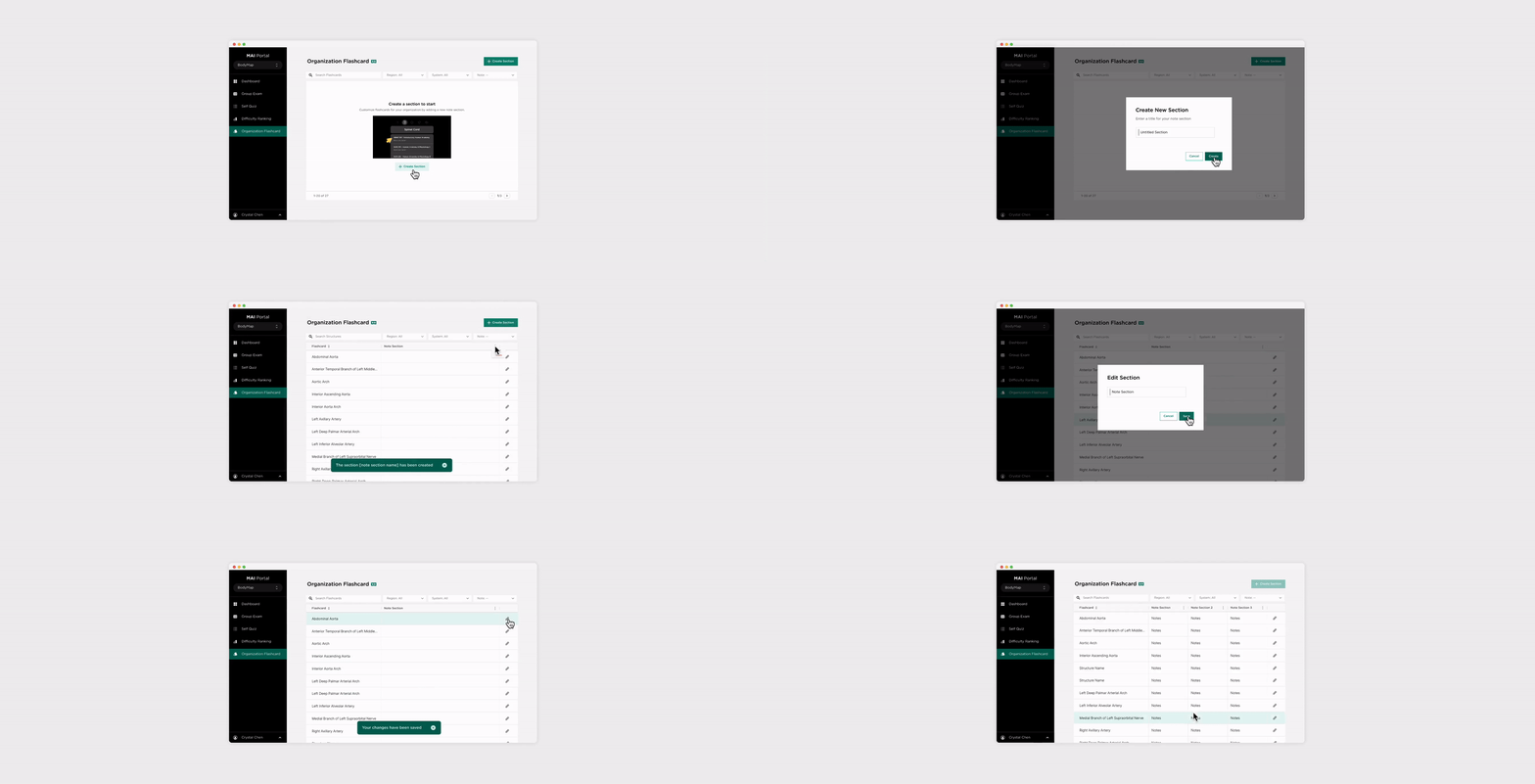
The goal of this feature is to optimize the customized flashcard functionality for improved user experience.

BodyMap Analytics Previous Version, My Flashcards page
MAI Portal, Organization Flashcard page

Group Exam Feature

We streamlined the exam creation process for instructors, enabling them to create, edit, and manage exams with ease. Additionally, both instructors and students could now view exam results in real-time, enhancing the learning feedback loop.

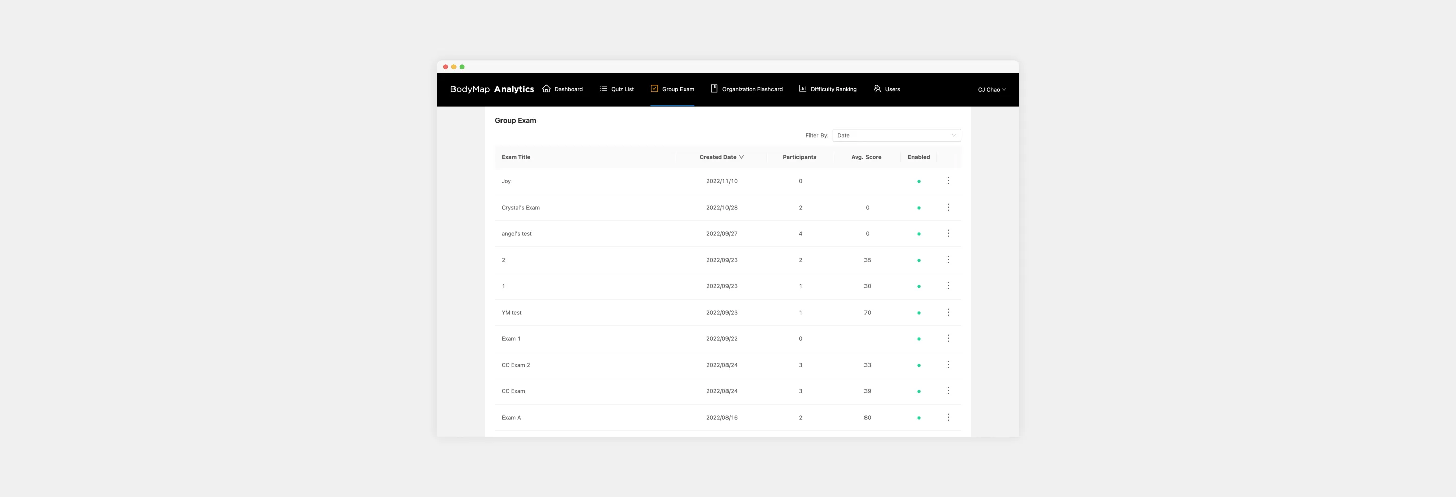
Snapshot of the previous version of the BodyMap Analytics, specifically featuring the Group Exam page.
BodyMap Analytics Previous Version, Group Exam page
MAI Portal, Group Exam page

● Reflection

This project reinforced the importance of building a unified design system. Having a consistent system of components, with clear rules and naming conventions, allowed us to collaborate more effectively and scale the product efficiently.
Key lessons included:

Design System Consistency: Always refer to the UI Kit to maintain uniformity across components.

Effective File Naming: With complex and evolving flows, proper file naming became essential for seamless communication and project management.

Collaboration Across Teams: Clear communication between designers and developers, particularly around component integration and variant management, was crucial to the project's success.